I mapped every delay on the British rail network
Mapping delays on the British railway network: two failures and the one that worked
For a while now, I’ve wanted to create a network-wide visualisation showing statistics about each section of track: how many services it carries, how delayed it is, or how many cancellations there have been. This has proven to be a complex task - requiring the joining of many complex datasets, no small amount of manual verification, and lots of Claude tokens. Today, we’re going to explore how I created the below visualisation, and what data was needed to bring it to life. Once we’ve done that, we’ll spend a bit of time exploring the visualisation, noting interesting patterns.
An interactive map of the UK’s rail routes, over all of 2025.
How did we get here?
It started months ago, where I attempted my first prototype. This took each pair of TIPLOCs - timing point locations, marking “important” points on the railway such as stations or junctions - for a service (for example, Bristol -> Keynsham -> Bath) and used OpenStreetMap to compute a route between the two points, using only railways. This was incredibly compute heavy - I had ~2,800 TIPLOCs in my database at this point, and we needed to compute maps for each of the points nearest neighbours.
This strategy worked to a point, once I had my computed route geometries (I called segments) we could map a service by walking its TIPLOC points and adding them to the graph. However, data got in my way. Many services only reported some of their TIPLOC points - not all of them. This was especially bad on quad-track sections, where fast services would skip stations entirely. The algorithm would then plot these fast services as a straight line, skipping the intermediate stations.
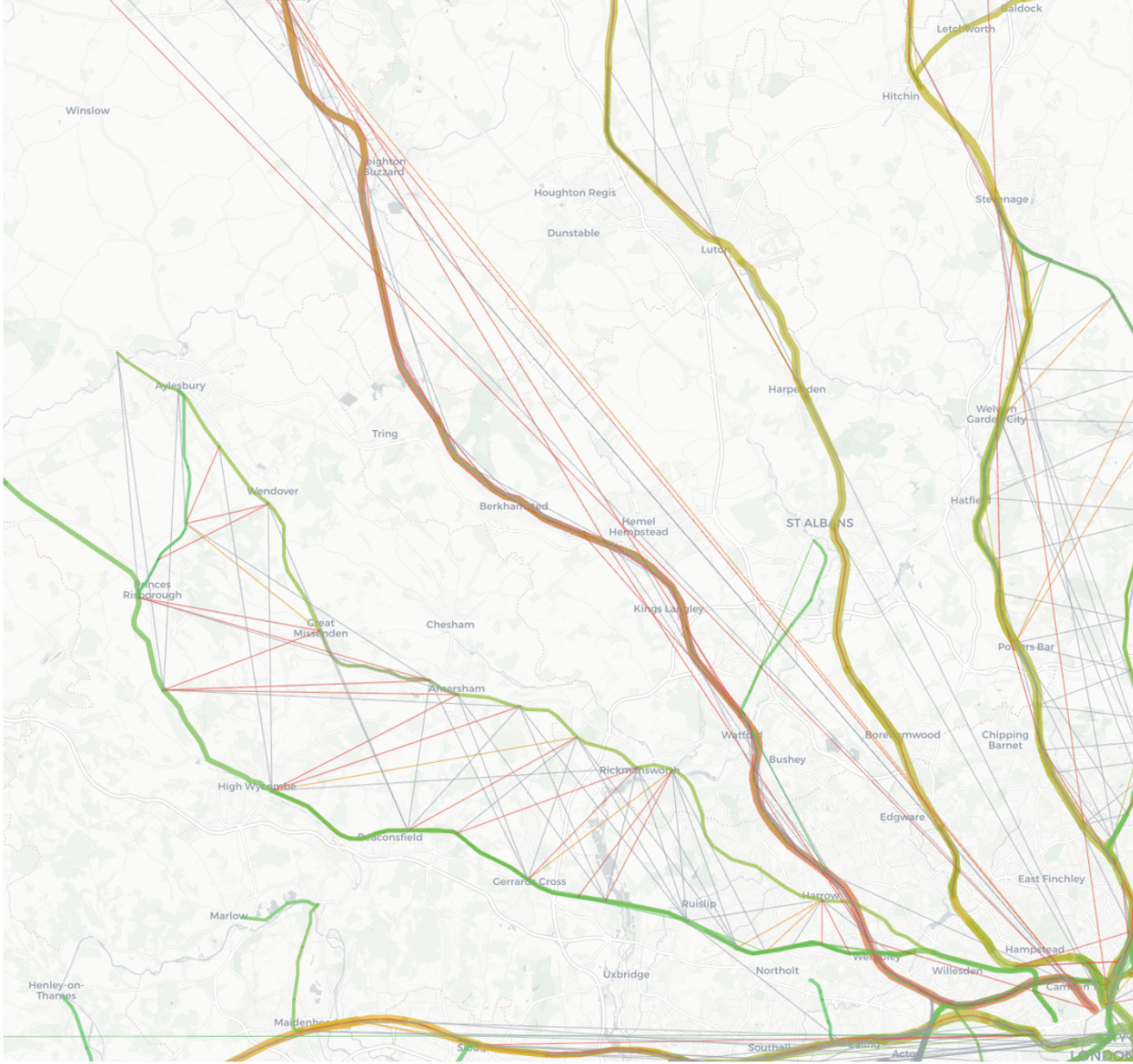
While this had some usefulness, the chaotic lines made the visualisation hard to understand and often meant there were two lines representing a single bit of track - not very useful. A new strategy was needed.
A crisis of confidence
I’d hit a brick wall with the above approach. The Darwin data was just not good enough - too many services didn’t report stops (or my ingestion missed them - always an option!).
So what’s next? I decided to take a different tack, drawing inspiration from network diagrams, as opposed to real maps. What if we used all the junctions on the network and used them as nodes in our graph. We could then just represent a service as an edge on that (simplified) graph, and not rely on real-life segments at all. It would show links between each major point on the graph clearly.
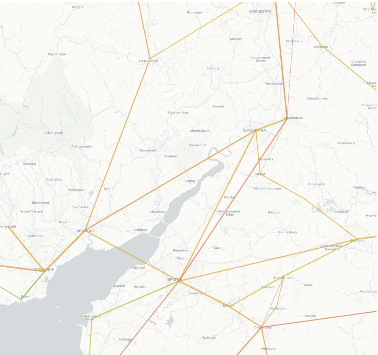
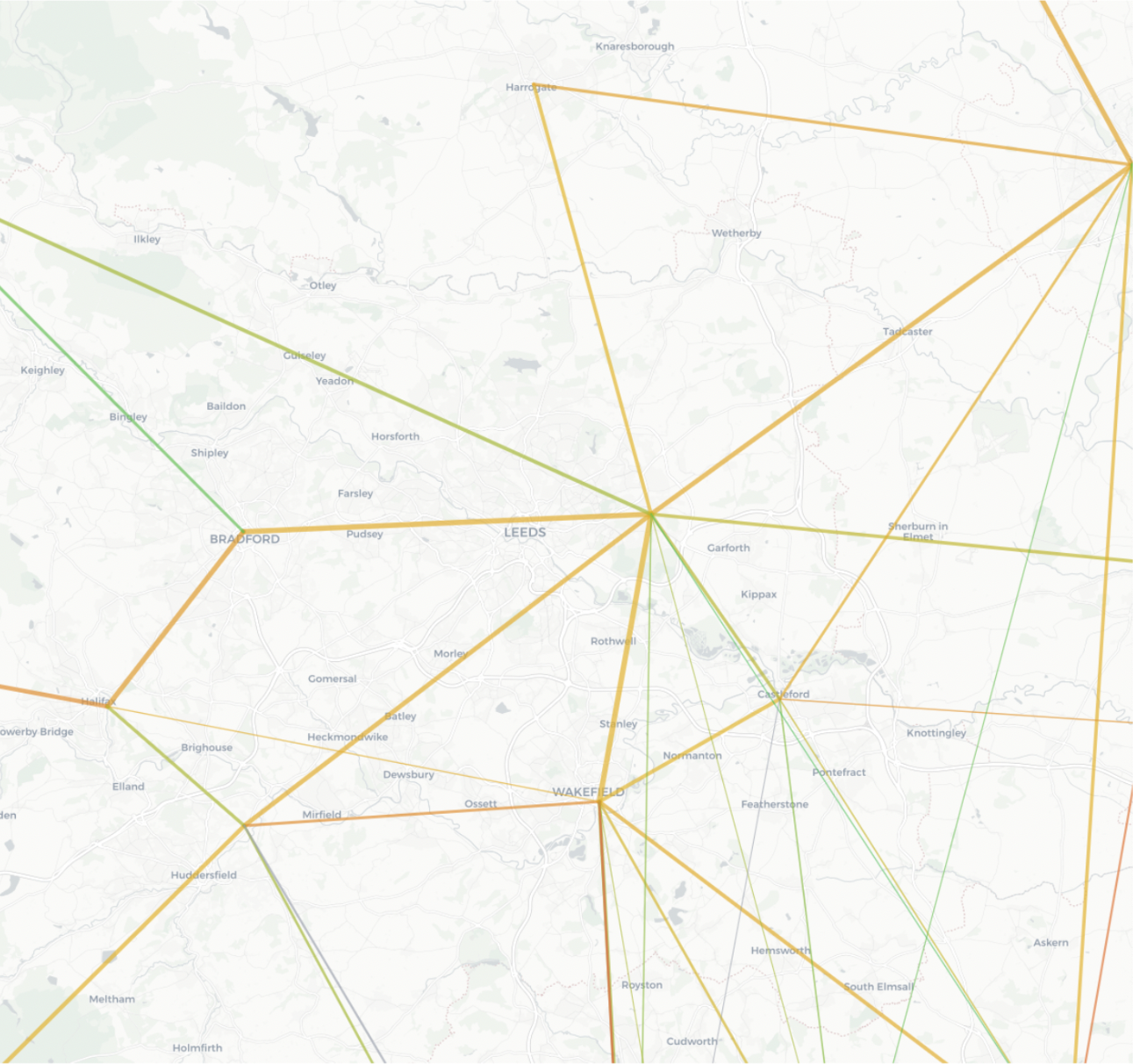
The reality was not that. For example, this area around Bristol seems to show two lines going north - one to Gloucester, one to Cheltenham. This isn’t true, there’s one line that splits just outside of Gloucester. This didn’t represent what I wanted - and for more complex areas, such as around Leeds, it showed so little information it was broadly useless. Maybe this would work for only the major cities of the UK - but not for what I wanted.
The route to victory
After scrolling through dataset after dataset, I came across Network Rail’s (the infrastructure operator in the UK) route diagrams. They contain information on segments of track, along with route geometries - perfect for my use case!
Most of the segments are short in length - so worked well for the visualisation, but there were some mammoth ones - one over 200km! That’s not very representative - as thousands of services would be included in that segment, even if they only traversed a small section. These needed to be split up.
Step one was to map the station TIPLOCs onto the route geometries. This was trial and error, as many stations were marked as being kilometres from a route - these were moved manually. There are also several stations with multiple TIPLOC codes too - causing segments to skew wildly around larger stations. The solution for these was to aggregate them, and pick the midpoint of the grouped codes. Once we had the TIPLOCs in place, we could split the routes into smaller chunks - creating a set of segments to visualise.
Working out if a service should be represented in a segment wasn’t as easy though. For example, a service from Ely that terminates at Peterborough - should that be included in the segments for the East Coast Main Line? It’s entered one of the TIPLOCs along the route - Peterborough, but you could hardly say it’s been on the line. The simple answer to this was for a service to have stopped or passed two TIPLOCs in a given segment, however this has now caused some missed services - again not all services mark all points as passed!
For now, I’ve accepted that my numbers may be slightly off, and called it quits here. But I’m keen to continue exploring how to improve the visualisation. To finish, let’s look at a few interesting points in the visualisation.
Now we’re there, what can we see?
This map shows the UK rail network - coloured by the total delay for each segment. This delay metric is computed as the lateness of each service through a given section - so a train that’s 30 minutes delayed will contribute 30 minutes of delay to each segment it passes through. You can also see the average delay, which is the average delay of any service passing through the segment.
The width of the routes denotes the number of services - hence there are some thick lines around London! You can also filter by train operating company, number of services and delay/cancellations.
The first thing that jumps out here is the red line snaking from London towards Birmingham and Manchester. This is the West Coast Mainline and judging from this visualisation it’s the most delayed major line in the country; with an average delay of around 5-6 minutes. Most other longer-distance lines don’t fare much better, with the East Coast Main Line coming in around 4-5 minutes, and the Great Western Main Line at ~3 minutes. This is in contrast to the web of commuter lines around London - many of these sit at less than 2 minutes delayed on average - impressive given the number of services that run across these lines.
Let’s talk briefly about the number of services. Only three London main stations - Marylebone, Fenchurch Street and Moorgate saw less than 100,000 trains last year. 100,000 is hard to visualise - let’s assume each train is 8 carriages long (I know Chiltern services are smaller, but bear with me here), then 100,000 trains would stretch nearly 20,000 km - from London to New Zealand - you can’t even get a direct flight that far!
And these are the small stations - Clapham Junction sees services from both Victoria and Waterloo, totalling ~488,000 services, that is 1300 trains per day. That’s more than one a minute for 20 hours a day!
Back to the delays - it looks like there are two key lines which feature heavily in our top 10 most-delayed sections. The Merseyrail services run along the Wirral line into Liverpool Central, and the lower sections of the West Coast Mainline, mostly between Wembley and Rugby. We’ll talk more about the West Coast Mainline in the next blog post.
Top 10 segments by total delay
| # | Segment | Total delay (minutes) |
|---|---|---|
| 1 | Wembley Central – Harrow & Wealdstone | 511,928 |
| 2 | London Euston – Wembley Central | 506,546 |
| 3 | Bletchley – Milton Keynes Central | 481,965 |
| 4 | Milton Keynes Central – Wolverton | 451,518 |
| 5 | Wolverton – Rugby | 446,221 |
| 6 | Moorfields – Liverpool Central | 444,484 |
| 7 | Birkenhead Hamilton Square – Moorfields | 404,146 |
| 8 | Liverpool James Street – Liverpool Lime Street Low Level | 404,054 |
| 9 | Moorfields – Liverpool Lime Street Low Level | 403,338 |
| 10 | Norton Bridge – Rugeley Trent Valley | 394,494 |
Top 10 segments by average delay
| # | Segment | Average delay (minutes) |
|---|---|---|
| 1 | Heysham Port | 45.5 |
| 2 | Capenhurst – Bache | 13.8 |
| 3 | Bebington – Rock Ferry | 13.3 |
| 4 | Spital – Port Sunlight | 13.3 |
| 5 | Bromborough Rake – Spital | 13.3 |
| 6 | Bromborough – Bromborough Rake | 13.3 |
| 7 | Eastham Rake – Bromborough | 13.3 |
| 8 | Port Sunlight – Bebington | 13.3 |
| 9 | Hooton – Eastham Rake | 13.3 |
| 10 | Green Lane – Rock Ferry | 13.3 |
Given what we’ve just said about the reliability of the London commuter lines, it’s strange to see a commuter line for another major city feature, despite its frequency. It also seems that the reliability of Merseyrail has been declining considerably in the last few years (ORR Merseyrail key statistics), dropping 15 percentage points since 2021 - although this has coincided with 50% more services running on the lines. This, with the introduction of a fleet transition to new trains, has likely impacted the service more than usual.
These are just a few of the interesting tidbits I’ve discovered from this map - please let me know about anything you’ve found in the comments below.
References
Darwin Data Feeds: https://www.nationalrail.co.uk/developers/darwin-data-feeds/ Rail Data Marketplace: https://raildata.org.uk/